


Overview
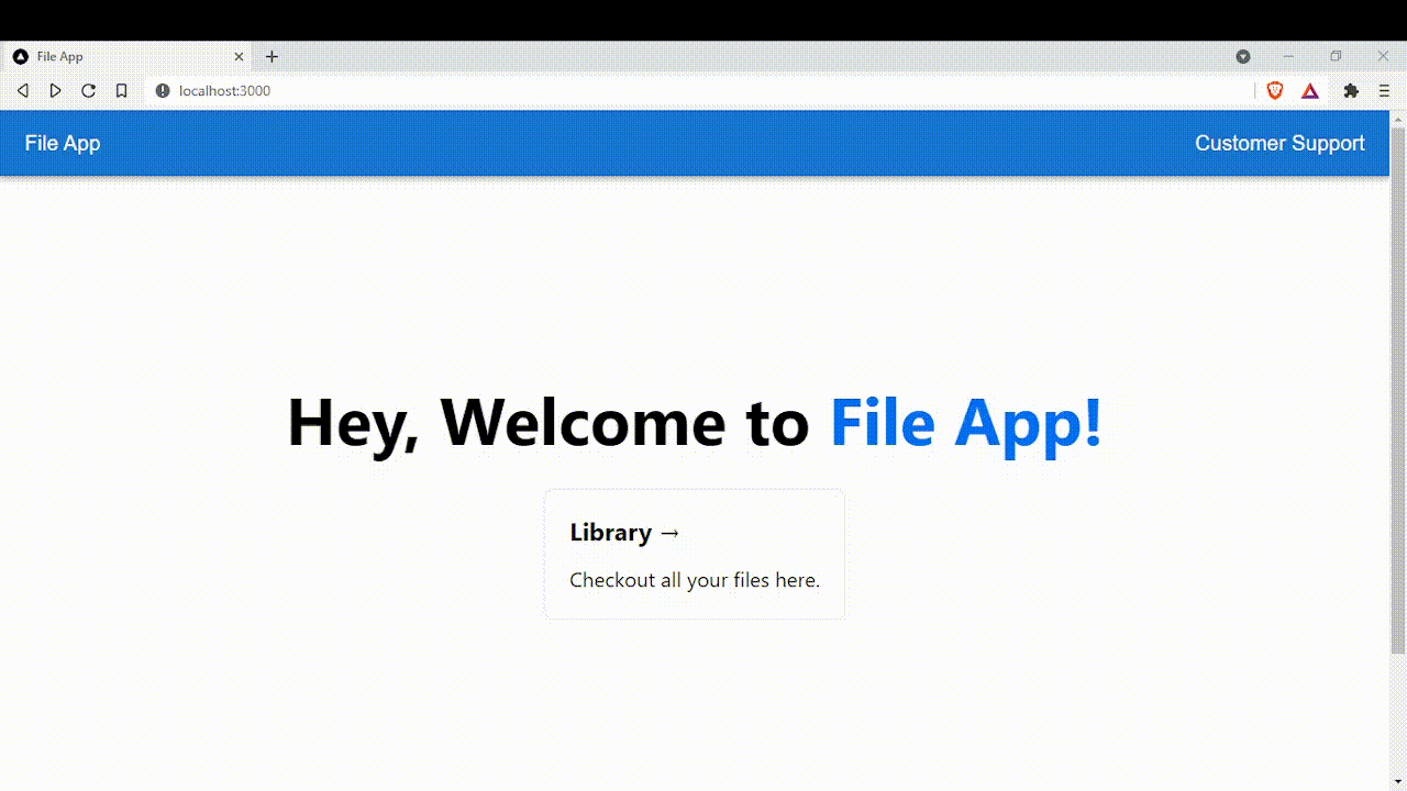
Welcome on board! In this series of articles, you'll learn everything you need to know about Next.js through project-based learning so you can get started with Next.js. If you have no idea what Next.js is, I highly recommend you to check out my newly released post here. Before we dive in, here is a sneak peek of what we're going to build:
Prerequisites
- HTML & CSS
- JavaScript
- Node.js
- Express
- React
Installation Process
For this project, I'll be using JavaScript. For now, let's create our very first Next.js app by running this command:
npx create-next-app@latest
# or
yarn create next-app
Then enter file-app as the name of the app. Boom! You've just created your first Next.js app. Second, we'll be styling our app with MUI (A React UI Library). For your information, previously MUI is known as MaterialUI.
Run this command to install MUI:
npm install @mui/material @emotion/react @emotion/styled
# or
yarn add @mui/material @emotion/react @emotion/styled
Finally, we can run our app by running & navigating to localhost:3000 in our browser:
npm run dev
Setting up the UI
1) Before setting up the UI, make sure package.json look exactly the same as shown below:
{
  "name": "file-app",
  "private": true,
  "scripts": {
    "dev": "next dev",
    "build": "next build",
    "start": "next start",
    "lint": "next lint"
  },
  "dependencies": {
    "@emotion/react": "^11.5.0",
    "@emotion/styled": "^11.3.0",
    "@mui/material": "^5.0.6",
    "next": "12.0.2",
    "react": "17.0.2",
    "react-dom": "17.0.2"
  },
  "devDependencies": {
    "eslint": "7.32.0",
    "eslint-config-next": "12.0.2"
  }
}
2) Next up, create a folder name src and a subfolder name components in the root directory. Inside components directory, create a file called Nav.js.
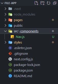
3) Inside Nav.js, we'll create a NavBar component using MUI.
// /src/components/Nav.js

import * as React from "react";
import AppBar from "@mui/material/AppBar";
import Box from "@mui/material/Box";
import Toolbar from "@mui/material/Toolbar";
import Typography from "@mui/material/Typography";

function Nav() {
  return (
    <Box sx={{ flexGrow: 1 }}>
      <AppBar position="static">
        <Toolbar>
          <Typography variant="h6" component="div" sx={{ flexGrow: 1 }}>
            File App
          </Typography>

          <Typography variant="h6" component="div" sx={{ flexGrow: 0 }}>
            Customer Support
          </Typography>
        </Toolbar>
      </AppBar>
    </Box>
  );
}

export default Nav;
4) Navigate to pages directory, open up index.js then copy and paste the code from here.
// /pages/index.js
import Head from "next/head";
import Image from "next/image";
import styles from "../styles/Home.module.css";
export default function Home() {
return (
<div className={styles.container}>
<Head>
<title>File App</title>
<meta name="description" content="Generated by create next app" />
<link rel="icon" href="/favicon.ico" />
</Head>
<main className={styles.main}>
<h1 className={styles.title}>
Hey, Welcome to <a>File App!</a>
</h1>
<div className={styles.grid}>
<a className={styles.card}>
<h2>Library →</h2>
<p>Checkout all your files here.</p>
</a>
</div>
</main>
<footer className={styles.footer}>
<a
href="https://vercel.com?utm_source=create-next-app&utm_medium=default-template&utm_campaign=create-next-app"
target="_blank"
rel="noopener noreferrer"
>
Powered by{" "}
<span className={styles.logo}>
<Image src="/vercel.svg" alt="Vercel Logo" width={72} height={16} />
</span>
</a>
</footer>
</div>
);
}
5) Navigate to /pages/_app.js & import Nav component so it's available anywhere in our application (or copy & paste from here, nothing fancy):
// /pages/_app.js

import "../styles/globals.css";
import Nav from "../src/components/Nav";

function MyApp({ Component, pageProps }) {
  return (
    <div>
      <Nav />
      <Component {...pageProps} />
    </div>
  );
}

export default MyApp;
6) After that, navigate to /styles/Home.module.css and edit the file (or copy & paste from here, nothing fancy):
// /styles/Home.module.css

.container {
  padding: 0;
}

.main {
  min-height: 100vh;
  padding: 4rem 0;
  flex: 1;
  display: flex;
  flex-direction: column;
  justify-content: center;
  align-items: center;
}

.footer {
  display: flex;
  flex: 1;
  padding: 2rem 0;
  border-top: 1px solid #eaeaea;
  justify-content: center;
  align-items: center;
}

.footer a {
  display: flex;
  justify-content: center;
  align-items: center;
  flex-grow: 1;
}

.title a {
  color: #0070f3;
  text-decoration: none;
}

.title a:hover,
.title a:focus,
.title a:active {
  text-decoration: underline;
}

.title {
  margin: 0;
  line-height: 1.15;
  font-size: 4rem;
}

.title,
.description {
  text-align: center;
}

.grid {
  display: flex;
  align-items: center;
  justify-content: center;
  flex-wrap: wrap;
  max-width: 800px;
}

.card {
  margin: 2rem;
  padding: 1.5rem;
  text-align: left;
  color: inherit;
  text-decoration: none;
  border: 1px solid #eaeaea;
  border-radius: 10px;
  transition: color 0.15s ease, border-color 0.15s ease;
  max-width: 300px;
}

.card:hover,
.card:focus,
.card:active {
  color: #0070f3;
  border-color: #0070f3;
}

.card h2 {
  margin: 0 0 1rem 0;
  font-size: 1.5rem;
}

.card p {
  margin: 0;
  font-size: 1.25rem;
  line-height: 1.5;
}

.logo {
  height: 1em;
  margin-left: 0.5rem;
}

@media (max-width: 600px) {
  .grid {
    width: 100%;
    flex-direction: column;
  }
}
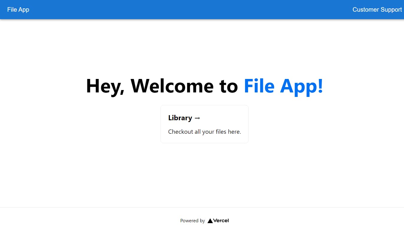
7) The final product of the UI looks like this.
Key Terms
I know y'all reading this article are getting excited about coding it up. But not quite yet, let's discuss some key terms in Next.js.
Fast Refresh
Fast Refresh is a built-in feature in Next.js. It gives us instant feedback on the browser when we made changes in our editor.
Pages & Routing
You might have noticed the
pagesdirectory in your root folder. Pages is a directory where developers can store a file that represents a page or a route in Next.js. It's also known as file-system based routing. For example: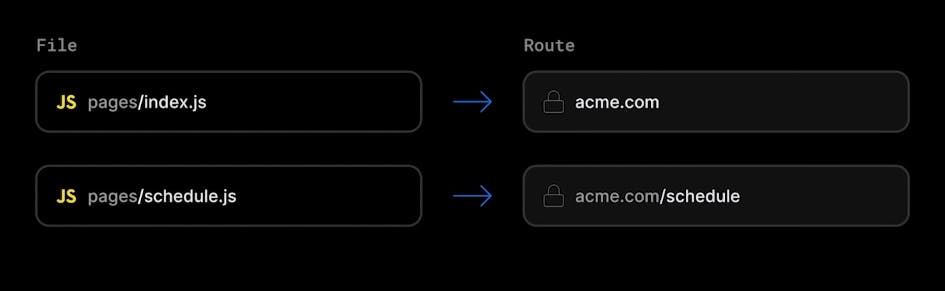
File-system based routing even support dynamic routes where developers can create a single file in the
pagesdirectory to generate any number of route for pages like blog posts you see on Hashnode. For example: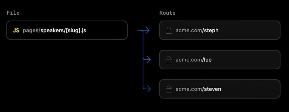
Navigation
Next.js provides developers a
Linkcomponent that builds on top of a regular anchor element. This component enables smoother client-side transition without having the page reload.Linkcomponent will also pre-fetch page information in the background for faster load.Apart from the
Linkcomponent, Next.js also provides additional helpful components such asImage,Head, and,Script. For more info, you can visit nextjs.org/docs.Rendering
There are two ways you can render your app in Next.js, it's generally best to know about client-side rendering and server-side rendering first before diving further.
Definition of Client-Side Rendering:
In a simple React app, the browser received the simple HTML shell along with JavaScript instructions to populate the UI. This is called client-side rendering because the initial rendering work happens on the user's device.
Definition of Pre-rendering:
Next.js pre-renders all the pages by default. Pre-rendering means the HTML is generated in advance on the server instead of having it all done by JavaScript on the client. When the page is pre-rendered, the user doesn't need to see a blank page while loading. This will result in better performance and SEO, and that's also the reason why it's recommended to build an e-commerce site or social media site with Next.js.
There are two types of pre-rendering methods though:
Server-Side Rendering
The term server-side rendering means the HTML on the page is pre-render on the server for each request before being sent to the client.
Static Site Generation
The term static site generation means the work is done once at build-time when the application is deployed.
For those who are new to the term "build time": Build time happens when you deploy your application. When you're using
getStaticProps(meaning ofgetStaticPropsbelow), it's expected your page to be static, the data doesn't change frequently. A blog site is an example of a static site because the content of the blog doesn't change on a regular basis. The page is only rendered once and served to each user that requests it.For those who are new to the term "request time": Request time happens when a user requests specific data for the page. If your data change on a regular basis, it's recommended to use
getServerSideProps(meaning ofgetServerSidePropsbelow) because Next.js is able to fetch up-to-date data and render the latest data to the page. A stock app that requires stock data from an external API is a good example because a stock app wouldn't want the users to see incorrect and outdated data.Data Fetching
There are a few ways to fetch data in Next.js, below are some of them:
getStaticProps
getStaticPropsallows developers to fetch data at build time.getServerSideProps
getServerSidePropsallows developers to fetch data on the server at request time.API routes
A simple solution for developers to build API endpoints in Next.js.
Client-side Data Fetching
By using an external library like useSWR, developers can get client-side data fetching whenever they need.
Styling Applications
There are tons of ways (at least 5 ways) developers style their applications.
There are two types of CSS files in Next.js, it's either Global CSS or CSS Module. If you're using Global CSS to style your application, you might fall into a potential pitfall in the future, CSS selectors by nature are global meaning anywhere in our app that uses the same
classNamewould get the same style. The probability of this happening increases when the size of an application grows.One solution to address this is to use a styling solution that Next.js provides is CSS Modules, developers can create a file name like so
header.module.cssand import it to a specific component. Behind the scenes, Next.js is using CSS Modules to avoid styling collision by automatically scoping rules to the component.In addition to CSS Modules, Next.js also gives us the flexibility to choose whichever styling solution we prefer like:
- CSS Modules
- CSS-in-JS Libraries
- CSS Frameworks (e.g. TailwindCSS)
- Global CSS or Sass Stylesheets
Conclusion
Whoah! That's a lot, right? Did you get the sense of why developers prefer Next.js instead of Create React App?
Hopefully, this article taught you the fundamentals and important terminology of Next.js. It's getting quite lengthy here, I'll have to stop. If you're interested in following up with this tutorial which I will be releasing soon, do consider following me on Hashnode. Happy learning!